Categorieën
English Striprecensie Strips

Review: Peter Pan by Regis Loisel

Peter Pan by French comic book artist Régis Loisel has been a wonderful reading experience. It’s been a while a graphic story was able to suck me in with great art and ditto storytelling but Loisel’s Peter Pan more than lived up to my expectations.

First of all, Loisel’s graphic novel is not a mere adaptation of J. M. Barrie Peter and Wendy, the classic story that has been adapted numerous times and itself was Barrie’s adaptation of his own stage play Peter Pan, or The Boy Who Wouldn’t Grow Up. Loisel has made a sequel to Barrie’s novel in which he relates the origin story of the beloved Peter Pan character. Readers who are only familiar with the Disney incarnation are in for a surprise, because this is a dark and brooding tale aimed at adults, not kids. Loisel shows us how a young lower-class kid named Peter came to be Peter Pan, how the Pirate Captain became Captain Hook and how even seemingly lovely fantasy lands can have terrible secrets.
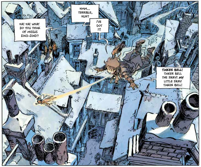
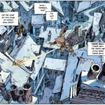
PeterPan_flying_webLondon, Winter 1887. Peter is a young boy who entertains his friends with stories and fantasies. Because all his friends live in an orphanage, one particular popular subject is Peter’s mum. They like to hear about how loving she is and how much she likes to take care of her little boy, which is as far from the truth as possible: Peter’s mum is an alcoholic who hates Peter’s guts. His only adult friend is Mister Kundal, the proprietor of a bar who feeds Peter food and stories. The world Peter lives in is very unfriendly to kids and all adults seem to be lowlifes craving booze and sex. It’s like Dickens with raging hormones. Peter basically hates all adults, except Mr. Kundal, and despises the sexualised Victorian London he lives in so much that he vows to never grow up and become a ‘dirty’ adult. When Peter’s mum has kicked him out of the house, he spends the night at the docks. Then a fairy appears whom Peter names Tinker Bell. She lets Peter fly through the air and takes him with her to Neverland, where fantastical creatures of all sorts welcome him as their savior from the dreaded Pirates that try to steal their treasure.

Peter, being the product of his times and upbringing, is quite the foulmouthed misogynist, calling Tinker Bell a slut at times, but basically is as stubborn and egotistical as every kid his age. On a side note: as if Pete’s world wasn’t dark enough, somehow Loisel ties Pan’s origin to the legend of Jack the Ripper as well. So yes, this Peter Pan-story is a bit on the dark side, but still Loisel offers a delightful adventure with well-rounded characters.

That’s all I want to say about the set up of the story, actually, because this comic’s wonders are best discovered by the readers themselves. Just prepare yourself for a wild, interesting and at times violent ride. The artwork by fantasy veteran Loisel looks stunning and lively; Tinker Bell has never looked so sexy. But be careful with this feisty little fairy, because she gets quite jealous and can be ruthless.
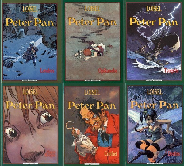
The original six covers.

Peter Pan was originally published in France in six volumes between 1990 and 2005. Last year Soaring Penguin Press published the first English translation including all six albums in one big, high quality omnibus. I am surprised it has taken so long for an English version of this book to appear, but better late than Never(land), I’d say.

This review was published on the wonderful blog of the American Book Center.
Categorieën
English Striprecensie Strips

Review X-Men: Days of Future Past

A while ago I wrote about writer Christ Claremont and his contributions to the X-Men universe. Since the new X-Men film, Days of Future Past, is partly based on Claremont’s story by the same title, I thought it would be nice to read the comic before watching the movie.

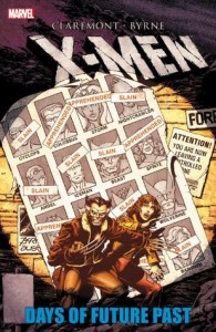
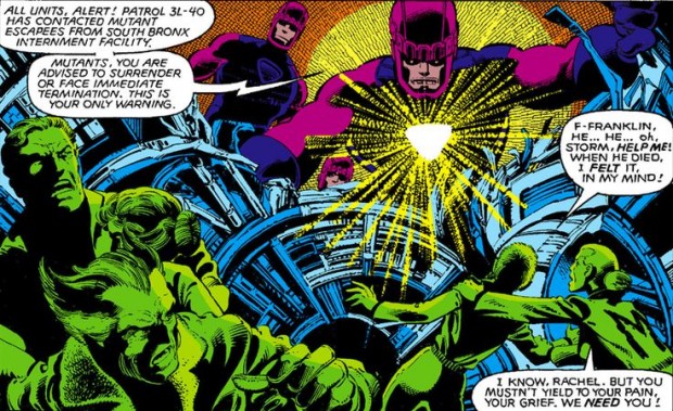
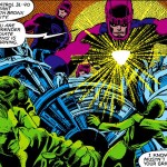
x-men_daysfuturepastDays of Future Past was originally published in The Uncanny X-Men #141 and #142 in 1981. The storyline alternates between the (then) present year of 1980 and 2013, at the time a date far into the future. 2013 is a dystopian future in which mutants are incarcerated in internment camps. A lot of the X-Men have lost their lives fighting the Sentinels: enormous robots that have the North American continent under complete control. Originally activated by the American government to eliminate the mutant menace, the Sentinels hunted not only mutants but all superheroes and villains. Now the rest of the world threatens war against the Sentinels, which could mean a nuclear holocaust and the end of the world all together. An adult Kate Pryde transfers her mind into her younger self, the present-day Kitty Pryde, who tries to convince the X-Men to help her prevent a fatal moment in history that triggers anti-mutant hysteria and will lead up to the dystopian future of 2013. Rachel Summers, who played a major role in X-Men: Ghosts, plays a small but instrumental part in this adventure.

It was great revisiting this classic and well-written storyline from the early eighties. Especially since Canadian comic book artist John Byrne was the artist to bring Claremont’s scripts to life at the time. Later on Byrne would write and draw highly regarded stories about The Fantastic Four and revitalise the Man of Steel. At this juncture in his career he and Claremont worked on The Uncanny X-Men, then one of the most if not most popular superhero comic book. Soon the team split because of creative differences: Byrne didn’t like Claremont’s characterisations of the characters. In Days of Future Past however, none of the animosity is noticeable.

The Sentinels attack.

Another treat when it comes to reading old comics is to see the fashions of the time, be it in the decors or the way people dress.

The story is collected in a trade paperback containing Uncanny X-Men 138-143 and X-Men annual #4 which is illustrated by John Romita Jr. The collection starts with the funeral of Jean Grey, moving on to an interesting story of the X-Men and Doctor Strange being trapped in a dimension quite similar to hell. Then Wolverine and Nightcrawler team up with Canadian superhero team Alpha Flight to capture the Wendigo, and… Well, why spoil all the storylines in advance? Needless to say: this trade is a must-read if you like the X-Men and want to see how the movie differs from the original comic, which it does quite a lot judging by the movie trailer, which shows it is Wolverine and not Pryde who tries to save the future by travelling to the past.

This review was written for and published on the blog of the American Book Center.

Categorieën
Boeken English Striprecensie Strips

Review: New York Drawings by Adrian Tomine

Could one fall in love with a girl in a drawing?

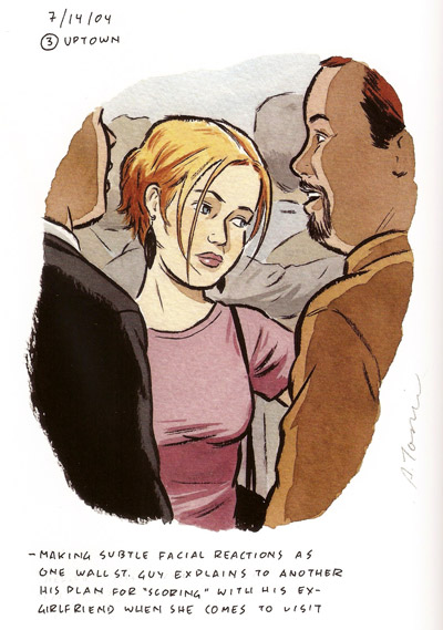
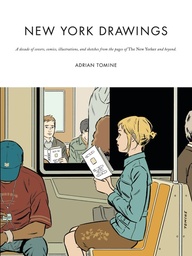
subwaygirl_tomineThat’s the question I asked myself when a sketch of a young woman standing in a crowded subway carriage caught my eye. She is framed by two Wall Street guys and can’t help overhearing one of them explaining his plan for scoring with his ex-girlfriend when she comes to visit, but I only know this last bit because the notes under the sketch tell me so. Just looking at the woman’s contemplating face, she could be thinking about anything, her mind floating somewhere far away from her mundane surroundings. It’s a striking portrait of a very attractive woman whose beauty has a natural girl-next-door quality. And with that last sentence I guess I just answered my own question. Yes, one can fall in love with a girl in a drawing, especially when the artist conveys some of her aura and at the same time leaves enough to one’s imagination to fill in the blanks with one’s own romantic musings.

The portrait is printed in New York Drawings, a wonderful collection of Adrian Tomine’s illustrations, covers and comics for The New Yorker magazine, and other illustrations inspired by the Big Apple, such as album covers, book jackets and sketches. Comic book artist and illustrator Tomine (Sacramento, 1974) moved from California to New York in 2004. He acquainted himself with his unfamiliar surroundings by compulsively drawing the people around him. ‘I started doing a lot of very quick, observational drawing in sketchbooks. I think I was looking for a reprieve from the rigid drawing style of the book I was working on at the time [Shortcomings], and I was also just spending a lot of time exploring the city on my own, and sketching was a way for me to still feel somewhat productive in the process,’ Tomine explains in the book.

WinterBreak_tomine

The illustrations are accompanied by the original publication date. Their titles are derived from the original article with which they originally paired in The New Yorker. The notes at the back of the book explain the image’s background, but I prefer to read the illustrations without them, so I can make up my own story about what the image conveys.

Tomine’s art and especially his clean-line style look similar to the likes of Daniel Clowes and Chris Ware. In an interview with The Comics Journal #205 Tomine mentioned Clowes and Jaime Hernandez as being major influences on his work. Although I love the stillness of his illustration-work, I have a slight preference towards Tomine’s sketches, which naturally have more spontaneous line-work and lively hand colouring, as opposed to the Photoshop-like colouring of the commissioned illustrations.

ny_drawingsFunnily enough, the book opens with a comic strip about Tomine’s first Christmas party hosted by The New Yorker. Typically for his comic book persona the artist presents himself as an introverted, somewhat neurotic newcomer, feeling out of place at the high-class party attended by celebrities such as Steve Martin and Philip Roth. Trying to find a comfortable pose he asks random people where he can find a coat rack while he treats the reader to a neurotic internal dialogue, not deprived of self-mockery I might add, explaining how he got to work for The New Yorker in the first place.

New York Drawings is an interesting way to see one of the greatest cities on earth through the eyes of a well-accomplished draughtsman.

This review was published on the wonderful blog of the American Book Center.
Categorieën
English Striprecensie Strips

Review: Battling Boy

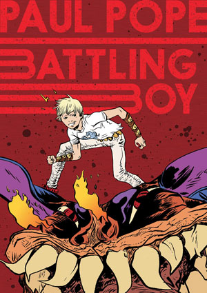
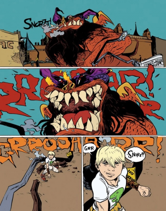
battling-boy-coverEven though in the past superhero comics were mainly aimed at kids, there weren’t a lot of child characters that were superheroes. Sometimes kids, or shall I say teens, were sidekicks, like Batman’s Robin. When the Amazing Spider-Man was introduced in 1962, it was the first time a teenager became the hero. And what a smash success it was, and to this day, still is. Since then, teenage superheroes are a lot more common. DC Comics has The Teen Titans for instance, and Marvel The New Mutants and Power Pack, which is a team that consists only of kids. Now American comic book writer/artist Paul Pope (THB, Batman: Year One Hundred) brings us Battling Boy.

The city of Arcopolis is ruled by fear: monsters roam the city streets and a gang of terrorists, lead by a ghoul named Sadisto, is kidnapping children. When the city champion Haggard West is killed, his sidekick daughter Aurora tries to step into West’s footsteps. Unknown to her, the demigod Battling Boy is sent to Earth by his parents on the eve of 13th birthday. It’s time for the boy’s ‘rambling’: in their culture, the rite of passage into adulthood consists a trial which teen boys must undergo. For Battling Boy this means it is up to him to fight the monsters and make Arcopolis a safe place again. Twelve enchanted T-shirts that imbue him with the powers of animal totems, a special cloak and an invisible credit card are the boy’s tools in accomplishing this immense task or die trying.

With Battling Boy, Pope specifically aims for a young audience. In an interview with BleedingCool.com he said the following about that particular choice:

‘It’s not that I don’t think modern comics aren’t accessible to kids, they can be. I just wanted to do something which has all of the cool stuff I remember loving from Silver Age comics and Heavy Metal. I wanted to do a story which had that, but the story is accessible for young readers as well. We all know many modern comics are aimed at readers who started in the Silver and Bronze Age. Guys my age at least (I am 43). I want to make material which will get new readers hooked on comics for life. Many of the kids I am meeting at seeing Battling Boy and I can tell it is their first comic book. That’s cool, it’s assuring future readers.’

Because Pope aims at teenagers, it is not surprising that most adult characters in this book – except the heroic Haggard West and Battling Boy’s parents – are either sleazy politicians like the major of Arcopolis, helpless parents whose kids get kidnapped or baddies who do the kidnapping. The mayor of the city tries to score points with his constituency by organising a big parade to introduce the new hero as ‘Arco-Lad’, who he the tries to use as a stooge. Here Pope shows his mistrust of institutions, bureaucrats and button-pushers, also seen in earlier work like Batman: Year One Hundred and The Ballad of Doctor Richardson. In Battling Boy he translates this theme into a worldview that must appeal to adolescents who by nature rebel against their elders. For Battling Boy it seems safer to mistrust adults all together, since none of them seem to be reliable partners. Let’s hope Aurora is able to give the lad a hand since Boy’s first fights with evil are anything but flawless.

Pope seems to know the hero’s journey as written by American mythologist Joseph Campbell by heart and clearly used it as a structural reference while composing the comic. He also refers to Silver Age comic books and Jack Kirby-style characters such as Battling Boy’s father, who seems to be a nod at Marvel comics’s mighty Thor. (On a funny note: this guy never takes off his helmet.)

Pope-Battling-Boy-2

I thought the people of Arcopolis were actually quite passive and seemed to be in a constant need of saving. This set-up might be a great stage for a kid superhero, but seems a bit too contrived for my taste. The story raises a couple of questions, like where do the monsters and ghouls come from, but Pope doesn’t address these in this first instalment of Battling Boy. Since this volume is only part one of a series, and not a completed story, I suspect answers will be given in future chapters. Be advised that after reading some 200 pages, a cliffhanger is waiting, leaving you wanting more.

Besides these minor points, Battling Boy is an entertaining, accessible, fast-paced coming-of-age story disguised as a superhero yarn dipped in some magic sauce, and actually quite entertaining for adults as well as kids.

This review was published on the blog of the American Book Center.
Categorieën
English Striprecensie Strips

Review X-Men: Ghosts by Chris Claremont

When I was in my teens I visited my grandmother on a regular basis. When she poured tea in one of those fragile porcelain cups, she’d start talking about the developments in the soap operas she followed. My grandmother was an avid watcher of The Bold and the Beautiful, As the World Turns and Days of Our Lives. So, you understand, she had A LOT to tell me about who dated whom, who wanted to kill whom, and which characters fell in love with each other this week. To be honest: I didn’t know what the hell she was talking about, since I never watched those shows. But to humour her, I never let on I didn’t know who Rich Forrester was.

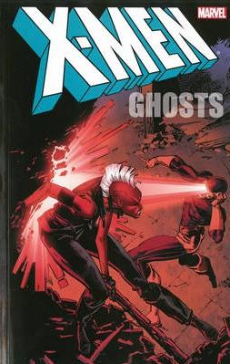
x-men_ghosts_coverNow, why am I bringing my late grandmother and her daily television fetishes up? When I started reading X-Men: Ghosts, knowing I had to review this book for the ABC blog, I started to worry I might come across like my grandmother, because not only do these X-Men stories involve large casts of characters, writer Chris Claremont has a knack for weaving many threads of plotlines into his stories. He basically writes soap operas about characters wearing longer underwear.

But let’s give it a try nonetheless. What the heck, there are worse things than being compared to my grandmother, who was a sweet old woman.

The X-Men were created in the 1960’s by Stan Lee and Jack Kirby. Getting tired of figuring out scientific experiments and accidents with radiation that could give superheroes their special powers, Lee figured: what if they were born with their powers and these special abilities kick in when they reach puberty. So that’s how the race of homo superior, a.k.a. mutants, was born.

In their first incarnation The X-Men were super powered teenagers who were enrolled at the private school of Professor Charles Xavier, a wheelchair-bound psychic. Under his leadership The X-Men tried to save humanity from all kinds of danger, especially mutants who wanted to conquer the world to make it a safer place for their own kind. You see, regular people are often afraid of these specially-powered beings, which make the X-Men stories full of metaphors about racism and the state of society as is.

To be honest, the X-Men weren’t a big success at the time and after a couple of years Marvel only reprinted old stories for a while. In 1975 Marvel published Giant Size X-Men #1 by writer Len Wein and artist David Cockrum and that started a revitalisation of the title. The new team had an international flavour: members came from all over the globe and they weren’t mere teenagers anymore either. When Chris Claremont took over the reigns as author, the X-Men became one of the most popular comic books. For a long period of time the series was the best-selling title, topping other Marvel publications such as Amazing Spider-Man and Avengers. X-Men: Ghosts collects a year worth of comics of Claremont’s mid-eighties stories. Claremont’s run on the title lasted about 16 years (!) by the way. It isn’t very common that a writer sticks to one title that long in the comics industry.

People who have seen the X-Men-movies will be familiar with most of the characters: there’s Wolverine, Cyclops, Storm, Colossus, Kitty Pryde and Rogue in this version of the X-Men. That’s not really surprising though, since the filmmakers took a lot of their story ideas from Claremont’s stories.

Still, when one starts to read, it takes a while to get into the different storylines that were set out before. But don’t worry: the short synopsis at the beginning of the book helps a bit. Besides, just like a real soap, it only takes a short while before you’re right into the action and know who’s who. Comics have a serial form of storytelling, with issues coming out each month. The stories are always written in a way that accommodates new readers.

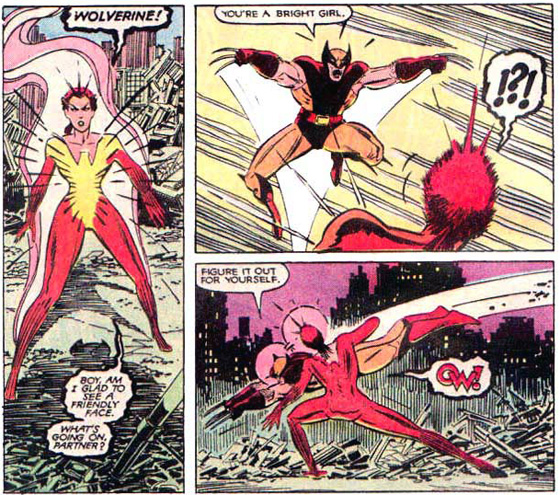
Wolverine versus Phoenix

This collection seems to focus on telepath Rachel Summers: in an alternate future where robotic Sentinels dominated mutants, Rachel Summers was Cyclops and Jean Grey’s daughter. Traumatized by being forced to hunt her fellow mutants as a “hound”, Rachel was later hurled back in time to the present. She became part of the X-Men. However she soon discovered she was not in her own past but in a different timeline: certain details were different, including her mother’s death. In X-Men: Ghosts Rachel claims her mother’s Phoenix power to battle a godlike creature called the Beyonder who threatens to destroy our universe. Trying to make amends for her chequered past, she makes some rash decisions a number of times. Although her actions are meant well, they do not seem to work out for the better. It is up to teammate Wolverine to stop the ever-powerful Rachel from becoming a ruthless killer.

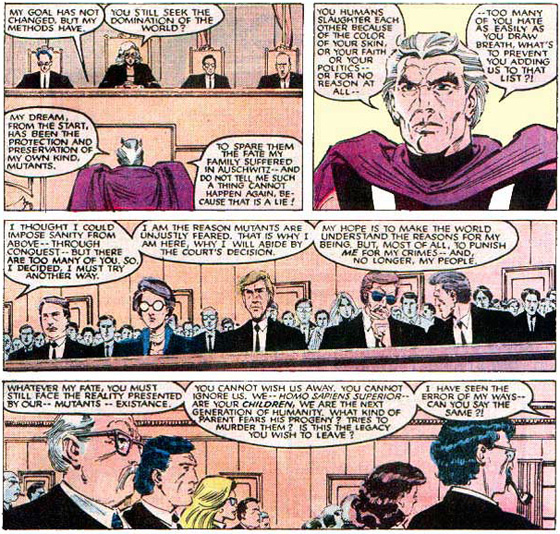
Also, Magneto, for years the nemesis of the X-Men, has become their friend since they learned of his childhood imprisonment in Auschwitz. Magneto decides to reform and when Xavier is mortally wounded, he asks his old friend to look over the X-Men. Magneto may be a good guy now, but being charged with crimes against humanity he still has to stand trial for the international court of justice.

Magneto stands trial.

For me it was a real treat to re-read these stories from the nineteen eighties. Chris Claremont’s talented writing and great feel for dialogue turns these characters into living and breathing creatures that really have an impact on an emotional level. As far as superhero stories go, Claremont offers a nice mix between personal development of all the characters and action packed battles.

I loved John Romita Jr.’s early artwork. He is still one of the best artists in the business today. Guest artists are Barry Windsor-Smith, Arthur Adams and Rick Leonardi. This paperback also contains two articles from Marvel Age, the official fanzine published by Marvel Comics at the time, focusing on the history of the X-Men and the art team of John Romita Jr. and inker Dan Green. The only problem I had with this trade is that, after the last page is read, the story is far from over and leaves you hungry for more. But isn’t that what soap opera is all about?

This review was written for and published on the blog of the American Book Center.
Categorieën
English Striprecensie Strips

Review: The Fifth Beatle, The Brian Epstein Story

When I was a teenager I found my father’s Beatles record collection in the attic (we’re talking vinyl, by the way). Ever since then, to me The Beatles has been the most important band on earth, ever. To this day, their music resonates within my soul, forming a large and interesting part of the soundtrack of my life. I guess everyone will be familiar with the Fab Four from Liverpool, so no further introduction is needed. Unfortunately, often the same can’t be said about their manager, Brian Epstein, who is far lesser known than John, Paul, George and Ringo.

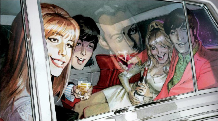
The Beatles having a grand ol time. In the reflection of the car window we see Brian Epstein, staying behind.

One could fill a library with the large number of books that have been published about the Beatles over the years. In the last couple of years, a couple of comic books about the boys from Liverpool came out and now there is The Fifth Beatle: the Brian Epstein Story to complement the lot. Graphic biographies are quite the trend in comic book land, it seems, and while generally speaking most of them are a bit stale and predictably follow the high and low points of someone’s life, some of them offer a good read. Fortunately, The Fifth Beatle, written by Broadway theatre producer Vivek Tiwary and expertly drawn by Andrew C. Robinson, is one of the latter category.

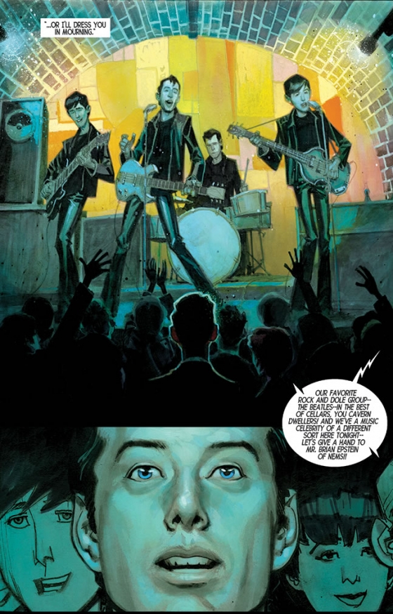
The book tells the story of the young and talented Brian Epstein who saw the Beatles play in the basement club The Cavern in Liverpool in 1961, when he was twenty-seven years old. Brian was running his family’s music store and had tried his hand at fashion design before that. He decided to manage the Beatles and thanks to Epstein’s perseverance and vision they became an international success. Tiwary tells a very layered tale, not shying away from the dark episodes of Epstein’s life. Epstein was a gay man living in an area in which, according to British law, being gay was illegal. Even though he successfully managed the Beatles and other popular British acts, Brian kept focusing on his mistakes, feeling out of place and lonely, and trying to find a place to belong. He became addicted to drugs. Brian died at age 32, accidentally overdosing on sleeping pills.

The book focuses on Epstein, letting the Beatles play second fiddle, which is fine, because Epstein’s story deserves to be told.

I like the fact that Tiwary uses juxtaposition as a literary device. In a brilliantly executed sequence Epstein is meeting Colonel Tom Parker, Elvis’s manager, for lunch. Parker is depicted as a greedy, ruthless and red-eyed devil who wolfs down his food, while Brian is shown to be a modest, well-mannered gentleman who hardly touches the grapefruit he ordered.

Robinson uses a very lively style that sits between caricature and realism, which works well with Tiwary’s tone of voice, which is serious and witty at the same time.

Cartoonist Kyle Baker got to draw some of the more unfortunate episodes in the history of the Beatles, like their troublesome tour in the Philippines and the backlash from John Lennon’s infamous ‘We’re bigger than Jesus!’ comment. Baker uses a cartoon-y drawing style that pays homage to the Beatles cartoon series, and the overall tone of this section of the book is brighter and funnier. In my opinion, since it doesn’t match with the rest of the book stylistically, it could have been left out.

Brian in awe of the Beatles.

‘As it turns out,’ the writer explains in his afterword, ‘almost everything in the pages you’ve just read actually did happen. But conveying the truth – while important – has never been my primary goal. My goal with The Fifth Beatle is to use 130 pages of my words and Andrew C. Robinson’s gorgeous art to reveal not just the facts but the poetry behind the Brian Epstein Story.’ As far as I am concerned, Tiwary succeeded very well in his intention. The Fifth Beatle is an interesting graphic poem.

This review is published on the blog of the American Book Center.
Categorieën
Boeken Striprecensie Strips

Recensie: Sticky Monsters van John Kenn Mortensen

‘I was born in Denmark 1978. I write and direct television shows for kids. I have a set of twins and not much time for anything. But when I have time I draw monsterdrawings on post-it notes… it is a little window into a different world, made on office supplies.’ Zo luidt het voorwoord van Sticky Monsters, een verzameling tekeningen van John Kenn Mortensen dat in 2012 werd uitgegeven door Square Peg.

johnkenn_118
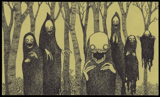
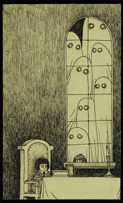
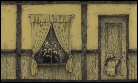
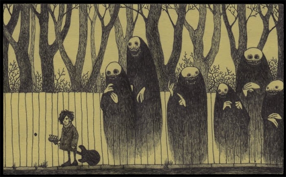
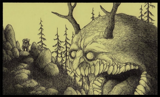
johnkenn_ 92Een kort en bondige introductie op een reeks illustraties waarnaar je uren kunt staren. Illustraties waarin bijvoorbeeld een groot ovaalvormig, harig monster met een lange spitsneus en een soort van gewei op zijn hoofd, achter een kind met een paraplu aan sluipt dat van steen tot steen springt. Of een vampierachtig meisje met grote oren en gevaarlijke tanden dat buiten de boomhut van een jongetje zweeft. Net boven de rand van de vensterbank staart het jongetje het meisje aan. Of een groep bleke, vettige creaturen met uitpuilende ogen, een grote bek en enorme klauwen als handen, die niet zou misstaan in een aflevering van Doctor Who. Ze lopen stampvoetend over de brug waar een jongetje met geruite pet onder schuilt.

De creaturen ademen soms de sfeer uit van een nachtmerrie of een horrorscenario, maar de andere keer lijken ze wel wat op de vriendelijke monstermuppets die je in Sesamstraat voorbij ziet komen.

Met dunne lijnen brengt Mortensen (die zichzelf online ook wel Don Kenn noemt) in zeer gedetailleerde tekeningen een bijzondere wereld tot leven, waar kinderen en monsterachtige verschijningen in allerlei vormen en maten de hoofdrol spelen. Een wereld die alleen bestaat op gele post-it-velletjes – vandaar de titel ‘Sticky’ Monsters – wat alle tekeningen een herkenbare lichtgele kleur geeft. In het boekje zijn de illustraties even groot als de originele afgedrukt. Juist omdat de tekenaar verder geen uitleg geeft en tekst ontbreekt, kun je je eigen verhaal bij het werk verzinnen. In wezen is het iedere bladzijde Halloween, zij het dan wel in het herkenbare handschrift van een verder bij mij onbekende illustrator.

'Trick or Treat?'
‘Trick or Treat?’

johnkenn_138

Wie lang genoeg kijkt ziet bepaalde thema’s en patronen terugkeren. Zo houden veel kinderen een ballon in hun hand, of houden ze een zwevend monster aan een touwtje vast alsof ze een ballon zijn. Veel monsters komen voor op zee waar iemand met een bootje vaart. De creaturen achtervolgen de kinderen vaak opgemerkt, en als ze wel door het kleine grut worden gezien, dan staart het kind ze met grote ogen aan. Soms maken de monsterlijke verschijningen onderdeel uit van het landschap.

johnkenn_186

Het werk van Kenn was ik wel eens tegengekomen op Tumblr. Hij houdt zelf al sinds 2009 dit blog bij en ook heeft hij zelf een Tumblr. Toen ik eerder dit jaar het boekje Sticky Monsters bij de American Book Center zag liggen, moest ik het aanschaffen. Geregeld pak ik het op en sla ik het boekje ergens open. Telkens ontdek ik weer een nieuw detail: een specifieke blik of een klein element op de achtergrond dat ik niet eerder zag. Het is heerlijk bladeren en vertoeven in de excentrieke, monsterlijk leuke en magische wereld van John Kenn Mortensen.

John Kenn Mortensen. Sticky Monsters.
Square Peg. £ 7,99
9780224 095761

Er is inmiddels ook een tweede boekje verschenen.

Categorieën
English Striprecensie Strips

Review: The Property

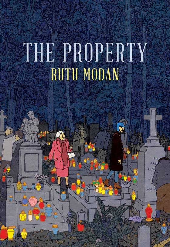
After the death of her son, Regina Segal takes her granddaughter Mica to Warshaw. They hope to reclaim a family property lost during World War II when her family had to flee the country. Soon Mica begins to wonder if the reasons for their trip might have nothing to do with the lost property per sé, but everything to do with what happened with her grandmother in the past.

She gets help from Tomasz, a Polish comic book artist/tour guide, to get acquainted with Warshaw. He also helps her get rid of a bothersome friend of the family, who Mica and her grandmother happen to bump into on the plane and now follows Mica around town.

PROPERTY_modan

Rutu Modan is an Israeli illustrator and comic book artist whose first graphic novel Exit Wounds (2007) received much critical acclaim and won the 2008 Eisner Award for Best New Graphic Novel. With The Property she made an elegant and intriguing little story. Her characterisations lean toward archetypes but Modan has a knack for natural-sounding dialogue so she is able to make her characters seem real and act natural.

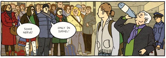
I liked the character of Regina, who seems to be a typical, stubborn grandmother who has a natural dislike for bureaucratic behaviour. This is demonstrated in the first scene in which a customs officer tells her she can’t bring her bottle of water with her on the plane because of security guidelines. She refuses to throw away a new bottle of perfectly good water, so when she doesn’t succeed in persuading the young man to let her have her water, she ostentatiously gulps down the contents of the whole bottle, making all the other passengers wait. Regina is the kind of woman that can be a pain in the ass sometimes, but who’s heart is in the right place.

property_customs

Intriguing detail: the credits list contains a list of actors. It seems Modan uses actors or models to base her characters on. Another detail I found interesting and a bit disappointing is the following: Modan drew her graphic novel in the clear-line style pioneered by Hergè, but the sketches in Tomasz’s sketchbook have a more natural look to them. These sketches appear to be drawn by Asaf Hanuka. I actually prefer the style of these sketches to the clear-line style Modan uses to visualise her graphic novel because the sketches seem livelier and more realistic while the clear-line drawing style is more academic. The sketches seem to draw you into the story world, while the clear-line style keeps a distance between the reader and the comic.

Because Modan collaborates with models and other artists she almost seems to operate like a film director when it comes to constructing a comic book. Speaking of film: I wouldn’t be surprised if this well-paced story will be made into a motion picture someday.

This review was published on the blog of the American Book Center.
Categorieën
English Striprecensie Strips

Review: Hand-drying in America

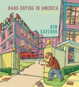
Because of its size, Ben Katchor’s Hand-Drying in America: And Other Stories is hard to overlook when walking by the bookcase. But what got me to pick it up, is Katchor’s eye-catching scratched-drawing style: his comics look like he sketches them directly on paper with a pen, without making a set-up in pencil first.

However, Katchor brilliantly uses this seemingly spontaneous way of drawing to make well-thought-out drawings rich with detail. For me, this symbolises the core of his work, which is Katchor’s penchant for small but quirky details of modern-day urban life.
handdrying_katchorKatchor’s stories in Hand-Drying… tend to favour topics related to architecture and urban design and the way people respond to them, which they often do in an atypical fashion. Most of the time his observations are very funny and dry. The story ‘Open House Season’ for instance, opens with the statement that our knowledge of the domestic interiors of a city is limited to the homes of a small circle of friends, acquaintances and relations. Few of us have the opportunity of a gasman or exterminator who visit a lot of houses. However, Open House Aficionados have a solution to that problem: they use the real estate section of the newspaper to pick out houses to visit. Not to buy, but to get a feel of the apartment and later discuss it with fellow Open House Aficionados.

The story from which the book takes its title deals with the adventurous undertakings of a businessman who wants to dry his hands after a visit to the toilet in a restaurant. He can choose between paper towels or an electric hand dryer, but of course the dispenser is empty and the dryer is out of order. We’ve al been there, yet still Katchor is able to give this tale an uneasy ending: the businessman has to shake hands with a foreign student even after all his efforts he still hasn’t been able to dry them properly. Urban life can be uneasy at times and pretty absurd, and that’s what Katchor deals with in one-page stories. They often ridicule the trappings of urban life so we can have a good laugh about it.

handdrying_memorial-225The material in Hand-Drying in America was originally serialized in Metropolis magazine between 1998 and 2012, a magazine that covers architecture and urban design, which explains why this collection of comics deals with design or urban issues. Then again, Katchor always had a knack for tackling urban themes in his comics and especially with using big cities as the setting for modern-day dystopia.

Ben Katchor (1951, New York) debuted in Raw Magazine. The comic character Julius Knipl, Real Estate Photographer, which he created for the Jewish socialist magazine, is probably his best-known work. The often moody and surrealist stories in this strip paint a picture of historical New York City.

Please take the time to check out Katchor’s presentation at Ted Talks (see below), for not only do you get a nice impression of his comic book artwork and stories, there’s nothing like hearing him reading his own work in his very distinctive way of speaking.

Ben Katchor will be at the Crossing Border Festival in The Hague on Saturday, November 16th, and in Antwerp on Sunday, November 17th. And he will be guest on VPRO’s Boeken on Sunday, Ned 1, 11:20-12:00. 

This review was published on the ABC Blog.

Categorieën
Strips

Striptips: Claire, Plunk, Comixiade en Superhelden

Van de striptips ben ik een beetje afgestapt de laatste tijd, want er zijn al genoeg stripblogs die een agenda bijhouden. Deze week en snel daarna gebeuren er echter zoveel leuke dingen in stripland dat ik toch even dit overzichtje voor je in elkaar heb gezet. Mocht je zelf nog een blijde gebeurtenis te melden hebben (die met strips te maken heeft, zwangerschappen alsjeblieft bij de Viva melden) dan mag dat uiteraard in het commentformulier.

Plunk!
De Plastieken Plunk is een prijs voor het beste Nederlandstalige of woordenloze korte stripverhaal die jaarlijks wordt uitgereikt. Tot 23 november kun je stemmen voor de Plunk Publieksprijs. De shortlist is inmiddels bekend. Check die en stem hier.

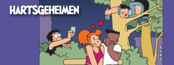
claire_hartsgeheimen

Onthulling Claire’s hartsgeheimen
Zaterdag 2 november presenteert stripwinkel Dick Bos te Rotterdam een feestelijke middag ter gelegenheid van het nieuwe 24e stripalbum uit de serie Claire! Tekenaar Robert van der Kroft is ook aanwezig, hij signeert en tekent een persoonlijke noot in ieder album. Bovendien brengt de winkel ter gelegenheid van deze signeersessie een ex-libris uit in een beperkte oplage van 50 stuks.
Iedereen is van harte welkom van 13.00 tot 17.00 in Stripwinkel Dick Bos.
Burgemeester Baumannlaan 119 a, Rotterdam-Overschie.

Comixiade @ABC Treehouse: book presentation, panel discussion and comics jam
Comixiade is an international network of comic strip artists and scenarists. In 2011 and 2012, Platform Spartak, in cooperation with a number of comics organisations throughout Europe, organized a string of workshops (‘comics jams’) in which artists from all over Europe and beyond met, mingled, and created awesome comics artwork together.
Their themes included migration, alienation, the new island state of Europe and many others.

Comixiade: The Book is an anthology of this project, containing all the artwork created, essays on the ideas behind Comixiade, and photo impressions of the events themselves. The project was funded by the European Cultural Foundation, the Book’s crafty design is by Lukas Malak and Aneta Bendakova (Czech Republic).

Zondag 3 november vindt de boekpresentatie plaats in The ABC Treehouse te Amsterdam. Tevens een panelgesprek over buitenlandse strips met Marcel Ruijters, Canan Marasligil en Joost Pollmann. Zie hier voor meer info.

Superhelden expositie in Tilburg
Studio Moan en Uitgeverij Wuft organiseren in samenwerking met NS16 de tentoonstelling ‘Superschelden’, geïnspireerd op een groot aantal krachttermen van striphelden uit de jaren ’60.

Dit zijn slechts twee van de twaalf verwensingen uit de expositie ‘Superschelden’. Helden als Spinneman, Batman en de Groene Lantaarn foeterden deze woorden in de Nederlandse comicpagina’s uit de jaren ‘60. In deze periode, die gepaard ging met een algeheel gevoel van optimisme, maakten horror en duisternis plaats voor positieve heldhaftige stripverhalen. Deze ‘Silver Age’ werd gekenmerkt door zijn fantasie, optimisme en kneuterigheid. Dit is direct terug te zien in de vaak haast sullige “scheldwoorden”, zoals ‘sapperdekriek!’ en ‘alle konijnenvellen!’

Zeefdrukken
Deze blijkbaar heldhaftige manier van frustratie of verbazing uiten dient als inspiratiebron voor een super-serie van twaalf zeefdrukken, gemaakt door verschillende jonge illustratoren. Maarten Donders, Bobbi Oskam, Levi Jacobs, Rik Wielheesen, Merel Cremers, Robin Nas, Martijn Moedars, Lennard Kok, Yngwie Boley, Sjors Tomlow, Nik van Es en Jasmijn de Nood hebben deze scheldwoorden omgezet in een mieterse zeefdruk. Al deze zeefdrukken worden tentoongesteld in het weekend van 15, 16 en 17 november in culturele broedplaats NS16 in Tilburg, aangevuld met comics, tekeningen en superheldenfilms uit de sixties. Ook is er gelegenheid om één van de zeefdrukken aan te schaffen: alle werken worden te koop aangeboden in een oplage van tien.

Opening
Op vrijdag 15 november wordt de tentoonstelling om 17.30 feestelijk geopend met euvele drankjes en knallende melodieën. De rest van het programma en een overzicht van alle deelnemende illustratoren (en superhelden) is te vinden op www.superschelden.nl

Categorieën
English Striprecensie Strips

Review: Kick-Ass 1, Hitgirl, and Kick-Ass 2

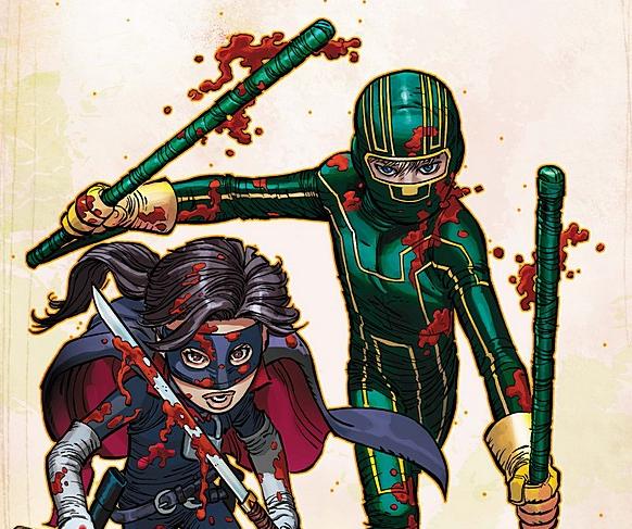
Dave Lizewski is just another ordinary American Teenager: he likes girls (but can’t get a date) and he loves videogames and comic books. One day he has an epiphany. ‘Why hasn’t anyone tried to be a superhero in real life?’ he asks himself, and decides to become one. Dressed up in a green bodysuit and a ski mask and armed with just a pair of batons he calls himself Kick-Ass. After walking around in his suit for weeks without doing anything really, his first act as a superhero is an attempt to stop three loitering hoodlums painting graffiti. They beat Dave into a pulp and stab him. When Dave stumbles into the street, he gets hit by a car. This experience answers his question: nobody dresses up as a superhero in real life because when they do, they get their ass kicked.

kickass1

In the hospital it takes numerous operations – they fit three metal plates inside his head – and after weeks of recovery and physical therapy Dave is well again. Before we know it, he’s back hitting the streets. After one of his fights ends up on YouTube, Kick-Ass is an overnight success, and more people start to dress up as superheroes. Like the mysterious Red Mist, who seems to steal the spotlight from Kick-Ass, and Dave doesn’t like that one bit. Soon he’ll learn there’s more to Red Mist than he suspects. Of all the hero-wannabees Hit-Girl and her partner in crime Big Daddy seem to be the genuine article. Although Hit-Girl is only ten, she’s a lethal weapon all by herself and soon things get very, very violent when they take on the mafia.

Original ideas
Kick-Ass
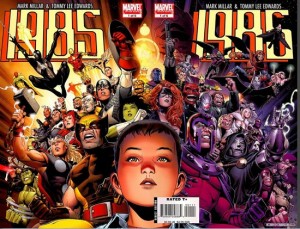
is the brainchild of comic book writer Mark Millar and artist legend John Romita Jr. Millar is known for ultraviolent comic books that deal with marvel1985coverinteresting concepts. In Marvel 1985, a limited series Millar wrote a couple of years ago, the baddies from the Marvel Universe all of a sudden show up in the real world and make havoc. Young Toby Goodman has to travel to the fictional world of Marvel to get help. In Superman: Red Son Millar explores the notion what would have happened if Superman’s rocket landed in Russia instead of Kansas, making him a communist hero. Millar also wrote hits like Wanted, which was turned into a film starring Angelina Jolie, and worked with John Romita Jr. on Wolverine: Enemy of the State.

Romita Jr. is one of the best artists working in the comic book industry today. For the past thirty plus years he’s drawn every major Marvel Comics character including Iron Man, Spider-Man and currently Captain America. Romita is a brilliant visual storyteller: he always puts ‘the camera’ in the right spot and makes sure he presents the story in a clear, exciting way. One can read his comics just by looking at the drawings.

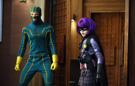
The first Kick-Ass comics inspired a film by the same name by director Matthew Vaughn, but this was not just a carbon copy adaptation. The comic book series had only just begun when the film was being written and shot, so the screen story deviates a bit from the comic book. Which is a good thing, because that way both stories are worth looking into. This summer the sequel Kick-Ass 2 is coming out, and that flick is based on the comics part two and part three in the series, respectively titled Hit-Girl and Kick-Ass 2.

Kick-Ass-hit-girl-schopt-ko

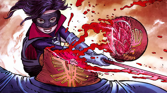
Hit-Girl is a great follow up to the original Kick-Ass comic and deals with the daily adventures of the title character. Although Mindy McCready as Hit-Girl could slice a mafia hoodlum in half with her sword without breaking a sweat, she has a hard time leading a normal life and blending in with her high school classmates. How can she outsmart Debbie Forman, smart-mouthed queen bee of the seventh-graders, if she doesn’t even know what Justin Bieber’s latest album is called and what the hell The Hunger Games are? This is where Dave Lizewski comes in. While Hit-Girl teaches him a thing or two about crime fighting, she learns from Dave what TV series are hip and what songs to put on her iPod.
When Red Mist and the Genovese gangster family try to get revenge on Hit-Girl and Kick-Ass for what they did to the Family in the first comic series, it’s just a matter of time before Mindy and Dave have to suit up once more.

Real-life superheroes
In the third story, Kick-Ass 2, Millar and Romita take the concept of real life superheroes up to a new level when Kick-Ass joins a superhero team. Besides chasing criminals, they also consider more mundane actions such as distribute blankets to the homeless and volunteer at a local hospice. (Stuff we never see DC Comics’s Justice League do.) This shows that Millar is really into tabs on the real-life superhero thing, which is a phenomenon that exists for real in the United States: people dress up as superheroes not so much to fight criminals but to help homeless people or volunteer to help other people in need.

Since Kick-Ass 2 is a comic book, soon things get really ugly and violent when Red Mist, now calling himself The Motherfucker, wants to be the biggest supervillain known to men. He and his group of hired thugs start a violent rampage targeting Kick-Ass’s family and friends and they leave a nasty, bloody trail of victims.

kick-ass-hit girl

The Kick-Ass stories are a wonderful, satirical take on the superhero genre, with a lot of humorous nods and winks at the comic book scene and contemporary popular culture. The humour makes the ultraviolent action sequences digestible for most readers. However, I had the feeling that in Kick-Ass 2 the creators went a bit overboard when for no particular reason the Motherfucker shoots a bunch of kids and adults in a quiet street in the suburbs. Although the depiction of violence has always been a big part of the story in the series – for example: when the mafia in the first series interrogates Dave they torture him and electrocute his scrotum – in Kick-Ass 2 the violence seems even harsher, even more in your face than before and this time it’s presented with little humour to lighten things up. I would say this kind of satire is probably not for the faint of heart.

Still, the artwork looks great, and on the whole, the Kick-Ass series is definitely worth reading for anyone who loves superheroes or likes to take a piss at dressed-up comic book characters. Needless to say: I am looking forward to the third series and the upcoming movie.

This review is published on the ABC blog.

Categorieën
Daily Webhead Strips Video

Daily Webhead Video: Typex schildert Rembrandt

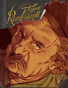
Zondag 14 juli stond stripmaker Typex voor The American Book Center te Amsterdam om een portret van Rembrandt, het onderwerp van zijn laatste graphic novel, te schilderen op de etalageruit van de boekwinkel. Aansluitend vond er een signeersessie plaats. Uiteraard was ik daar bij.

Typex_Rembrandt-coverTypex had een klein uurtje nodig om zijn werk af te maken. Daarna zat hij buiten in de zon om zijn boek Typex’ Rembrandt te signeren. Erg druk was het niet, deze hete zomerdag lagen de Amsterdammers liever in het gras in het park. Er kwam wel één fan helemaal uit Vlaardingen om een handtekening en een tekening in zijn boek te laten zetten. Deze man was eerst naar Den Haag afgereisd omdat hij dacht dat Typex bij dat filiaal van de ABC zou zitten, toen hij vernam dat hij naar Mokum moest, ging hij goed geluimd die kant op. Dat maakt hem wat mij betreft de stripfan van de week.

De muziek in deze Daily Webhead is wederom van de onvolprezen Marco Raaphorst.

Wil je ook een keer een video door mij laten maken? Neem dan vrijblijvend contact met me op.